

Is Showit Accessible? What That Even Means and How to Fix What’s Not

Okay but… are tou thinking what is “accessibility” and why should I care? Let’s keep it simple: accessibility means making your website usable for everyone– including people who have disabilities.
That could mean someone who:
- uses a screen reader because they’re blind or have low vision
- can’t use a mouse and navigates by keyboard
- has color blindness and can’t read certain color combos
- needs clear structure to understand content
It’s not about making your site boring or basic. It’s about making sure everyone can experience it the way you intended.
If you have a business, accessibility is not optional.
People need to be able to read, click, and navigate without frustration-no matter how they’re accessing your site.
Wait, But Isn’t Showit the “Worst” for Accessibility?
Okay, so there’s this idea floating around the internet that Showit sucks at accessibility. And like… I get where the hot take comes from. But let me clarify:
1. Showit isn’t inaccessible by default.
2. It’s just easy to build an inaccessible site if you don’t know what you’re doing. ( Which no one holds against you because desinging a site and doing all this on top of it is a LOT)
Showit can be accessible, but only if you make it that way…. It gives you full creative freedom (yay!), but that means it also doesn’t stop you from doing things that accidentally make your site hard to use (oops).
Here’s why this rumor started, and how Showit actually stacks up against platforms like Squarespace and Wix:
| Platform | why they love it | BUT | |
| Squarespace | – t has more structure, that it’s very simple in terms of layout, having basic accessibility baked in like the heading structures and ARIA roles | – Much less design freedom – Harder to customize without dev knowledge – Still requires you to manually check things like color contrast and alt text | – Great if you want done-for-you structure – Not great if you want full creative control |
| Wix | – Accesibility prompts are built in – There’s an accessibility wizard (which is cool but also kinda surface-level) | The design freedom can also lead to messy accessibility if you go rouge, and the wizard doesn’t fix everything… most people ignore it anyways. | – Decent middle ground for beginners – Still needs manual tweaks to be truly accessible |
Showit
While scrolling places like threads and in facebook groups I see comments about Showit saying,“It’s not accessible!”, “It doesn’t have ARIA labels or skip links!”, “There’s no alt text warning system!”
But here’s what’s actually true…. Showit gives you total freedom, which also means total responsibility. You know similar to what clark kent was saying about power and responsibility. Showit also doesn’t hold your hand with built-in accessibility alerts, which is how most of us can go off the rails and not know.
The thing is though, You can make it accessible- you just need to know what to do (which, hey! You’re doing right now!)
Real Talk:
People say Showit isn’t accessible not because it can’t be accessible– but because they weren’t taught how to build an accessible site in general.
The truth? No platform guarantees accessibility. You could mess it up on any of them.
Wanting to dive into it more to see how you can make sure your Showit site stays accessible? Follow these steps:
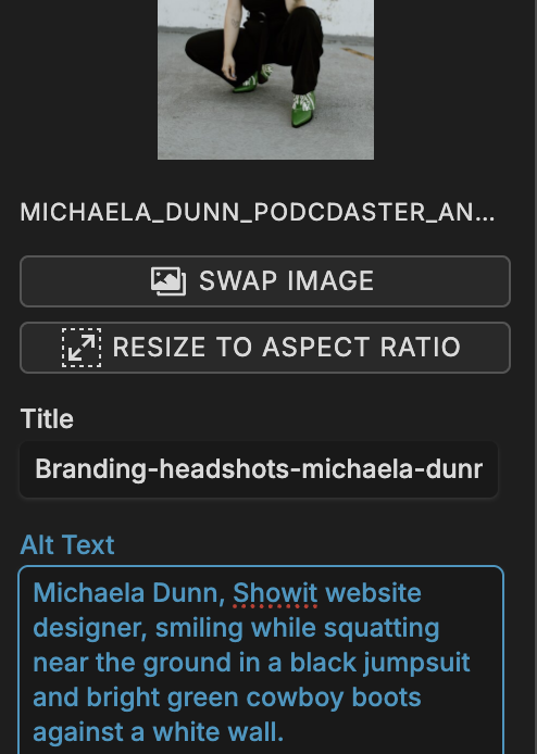
1. Use Alt Text for Every Image
Alt text is short for “alternative text.” It’s what screen readers read aloud to describe images to someone who can’t see them. Be their guide, and don’t just keyword stuff it- have it make sense, add keywords as they naturally fit.
How to do it in Showit:
When you upload a photo, there’s a box labeled Alt. Text. Type a quick description of what the image shows.
Example:
The box it usually blank so fill it with something to descirbe the image.
Use: Bride and groom dancing under string lights at Bear Ridge Venue
Bonus: Alt text also helps your SEO. Double win.
2. Use Real Headings (Not Just Bigger Fonts)
Because screen readers don’t care about font size, they care about structure
You know when you bold something and crank the font size up to 72pt and go “yes, this is a heading”? Cute visually. But screen readers don’t see that. They look for heading tags like H1, H2, H3, these are like road signs for your content.
Using proper headings helps everyone (Google included):
- Know what’s important
- Scan your content faster
- Understand the hierarchy (what’s a main point vs. a sub-point)
Example:
Let’s say your blog post is about “Wedding Planning Tips.”
You’d use:
- H1: Wedding Planning Tips
- H2: 1. Set Your Budget
- H3: How to Prioritize Your Spending
- H2: 2. Pick a Venue
…and so on.
Similarly you would layout your website content.
How to fix it in Showit:
Click on any text box → On the right side, find the dropdown labeled Text Tag → Choose H1, H2, etc. depending on the content’s role.
DO NOT: Use H1 more than once per page
DO: Use H2s for every major section
CAN: Use H3s if you’re getting into sub-points
Bonus tip: Proper headings help your Google ranking too…Google’s basically a screen reader with a search bar.
3. Make Sure Things Read in the Right Order
(Because screen readers don’t “see” your layout the way you do)
So here’s the deal: when you build a site on Showit, you get to drag and drop stuff wherever you want. A headline can be floating in the top left corner, your text box can be under that, and your button off to the side. It looks right when you preview it. But behind the scenes? It might be totally jumbled.
What’s actually happening:
Screen readers (used by blind and visually impaired users) don’t “see” your design-they read your content based on the layer order in your panel. Think of it like a reading list. Whatever’s listed first in your Showit layers panel is what gets read first.
If your layers are out of order, someone using a screen reader might hear:
“Footer menu. Button: Work With Me. Heading: Let’s Talk. Text: Welcome to my website!”
and well OOF That’s not a great first impression….
Why it matters:
If someone can’t follow your content in a logical way, they’ll bounce. That includes people using assistive tech and anyone who’s neurodivergent or just gets overwhelmed by messy structure.
A messy order = a confusing experience = less connection = lost client.
We don’t want that.
How to fix it (no tech skills needed):
- Open your Layers Panel in Showit
This is the list on the left side of the editor showing all the elements on your page. - Reorder everything to match the flow of the page
Top to bottom, left to right. So:- Heading
- Paragraph text
- Button
- Image (if it’s important-not decorative)
- Next section’s heading
- etc.
- Do this for both desktop AND mobile layouts
Mobile doesn’t automatically copy desktop order. You have to check and rearrange manually for mobile too (especially if you duplicated canvases).
Quick test:
Want to check if your content reads in the right order?
Hit Tab on your keyboard and see what it highlights, step by step. That’s how someone would navigate using keyboard-only access (which is a big part of accessibility too!).
4. Don’t Put Text Inside Image
This is one of the most common mistakes on Showit, especially because the platform lets you upload literally anything. So it’s tempting to design that dreamy quote graphic in Canva and drop it in as a PNG. But here’s the problem:
Screen readers can’t read text that’s inside an image.
If that’s the only place you’ve written those words, it’s invisible to anyone relying on assistive tech. Not to mention… Google can’t read it either.
Bad:
Uploading a quote like “You are worthy of being seen and celebrated” as an image
Better:
Type that quote in a text box on your site using Showit’s text editor, so it can be read aloud and indexed by search engines.
Quick fix:
- Use text boxes for all important words: headers, buttons, quotes, calls-to-action
- Use images for decorative flair, not for anything your audience needs to understand the content
Bonus: This also helps your site load faster, which = better SEO.
5. Color Contrast = A Big Deal
If people can’t read it, it doesn’t matter how cute it looks
You’ve got good taste, I know. But light pink text on a cream background? That’s not gonna work for someone with low vision, visual processing issues, or just bad lighting on their screen.
Color contrast is all about how different your text color is from the background color. The bigger the contrast, the easier it is to read. We want to make it as easy as possible for our viwers!!!
Bad combo:
Light grey text on white background = low visibility
Good combo:
Deep navy text on a pale peach background = legible + aesthetic
Tools to check:
Use the WebAIM Contrast Checker
Shoot for a ratio of 4.5:1 or higher for body text.
How to fix in Showit:
There’s no built-in contrast checker, so you’ll need to test manually. Choose colors that feel dreamy but function clearly. Save the low-contrast shades for background design, not for body text or buttons.
6. Make Your Navigation Clickable + Clear
(Because a website should never feel like a puzzle)
Navigation = the map of your site. And if that map is confusing, broken, or just… not clickable? People will bounce.
Common mistake on Showit: Using decorative text or image-based buttons for menus. These might look pretty, but they’re not always screen-reader friendly or even clickable by keyboard.
What to do instead:
- Use real text links in your nav
- Stick to Showit’s built-in navigation structure when possible
- Avoid turning important links into images
- Label things clearly: “Home,” “About,” “Contact” don’t make people guess
If someone’s using only their keyboard, they should be able to tab through your entire nav easily, no dead ends, no guesswork.
7. Mobile Matters a Lot
Most of your visitors are on mobile, and so are screen readers
We all love designing on our big, pretty desktop screens. But here’s the truth: if your mobile layout is a mess, your site isn’t accessible.
Mobile is the version most people will see and the one that screen readers often default to. If stuff is missing, misaligned, or totally out of order on mobile? That’s a big accessibility (and user experience) problem.
Your mobile view should:
- Include all the important content from desktop
- Follow a logical reading order
- Have clickable buttons that aren’t too small
- Avoid “pinch and zoom” chaos
How to fix in Showit:
Switch to Mobile View in the Showit editor and audit every canvas. Reorder text, double-check padding, and don’t hide key content just to make things look simpler.
Think of mobile as your storefront window…it needs to be clean, clear, and easy to walk through.
So, why does all this matter?
Because you didn’t build a website just to look pretty. You built it to be experienced, understood, and loved by real people. And those people deserve to access your work, no matter what device or ability they bring to the table.
Making your Showit website accessible doesn’t mean changing your style. It means designing with more people in mind. It’s thoughtful. It’s strategic. And honestly? It’s just good business.
Wanna make sure your site is actually working for everyone?
Let me take it off your plate. I design Showit websites that are beautiful and accessible—without sucking the fun or personality out of your brand.
🎉 Check out my website design services →
💌 Or slide into my inbox and let’s make some magic → Contact Michaela
But Before You Go…
If we haven’t officially met yet- hey, hi! I’m Michaela. I work with business owners ready to invest in a brand and website that do more than just look good…they convert, connect, and grow with you.
If you’re into honest business advice, kind encouragement, and the occasional “okay but let’s be real” moment you’re gonna feel right at home here.
Here are a few ways we can hang out more:
→ Need a website that doesn’t make you cringe?
I design Showit websites that are both strategic and scroll-stopping- so you can finally have a site that feels like you and works like magic. [Check out my Showit design services here.]
→ Want to DIY your site but need a solid head start?
Templates are coming soon! I’m creating Showit templates for business owners who want beauty, strategy, and simplicity without the custom price tag. Stay tuned!
→ Love this post? The blog is full of more goodness.
From branding clarity to website tips to running a business when your brain feels like scrambled eggs… I’ve got you. [Catch up on recent posts here.]
You can also always reach out directly, send me a DM on Instagram or email me at thedunndesignco@gmail.com. I’d love to hear about what you’re building.
Talk soon,
Michaela

